Case Study: Refreshing Twitter’s Icon system
OVERVIEW
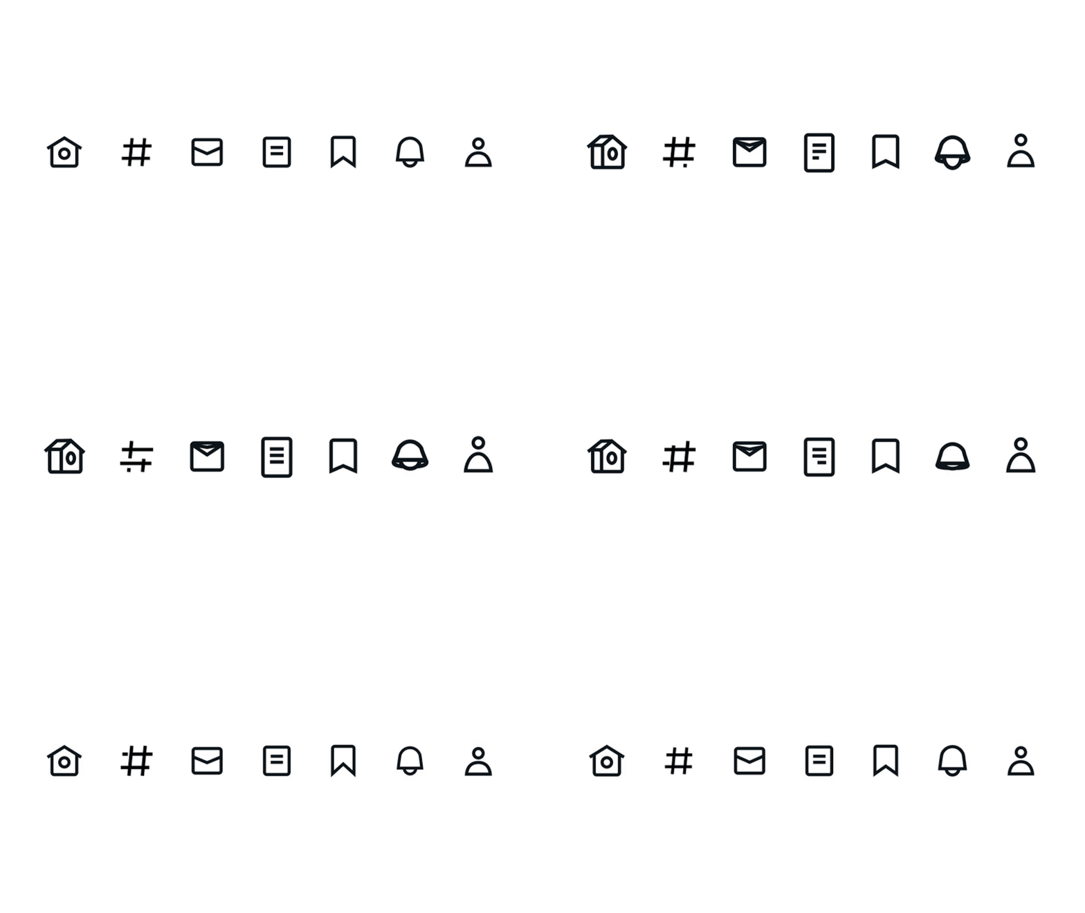
Our current suite of icons has been with us since the last redesign in 2017 — and while they’ve served us well recently, with our other visual design language updates, we identified a need to update them.
To refresh our icons, the design systems team under the Design Foundations teamed up with Iconist, the skilled iconographers, to evolve our set.
Our new icons were designed to feel part of the same family as our logo, typeface, and illustrations. The visual approach creates a cohesive set that feels inherently “Twittery” in a principled and systematic way.
THE GOAL
The goal is to create a cohesive set of icons that are bold in shape and style, yet still relatable and a little cheeky where possible.
My ROLE
Senior Product Designer & Iconographer
AGENCY
Iconists
PROJECT LEADS
Keith Miller & Teresa Mershon
DESIGNERS
Ashlie ford, Jason Sofonia, Griff Griffith
PROJECT MANAGERS
A’yen Tran & Christina Milan
THE PROCESS
The team began by identifying and addressing the key challenges of the existing set.
The weight and thickness of the strokes were too thin and no longer felt suitable with the other elements that had evolved with our redesign. Our typography was thicker and bolder, which made our icons feel out of place. Our introduction of a new illustration style further made our icons look dated and didn’t play well with our new bolder type styles and buttons.
Our icon library no longer felt cohesive.
Over time, the Edge Icon system diverged as we continued to grow it. A new style and design would allow us to make them all consistent and accommodate for anticipated rule breaks we’ve seen through the years.
The process of creating and managing icons was becoming difficult.
We saw a need to simplify and codify our icons so that future teams could easily follow the guidelines and not only create an icon but also upload them to Figma and our code base with ease.
What’s new?
Refreshed style across the set.
We merged the sets by redrawing every icon in the new style with a thicker stroke, reduced noise by simplifying shapes, and updated our grid, all focusing on accessibility.
The vast majority of icons kept the same metaphor as before. However, some would be best with metaphor changes currently going through user research to affirm our hypothesis.
Icon library
Another big focus was to bring our Icon component library up to date.
The change meant several things:
We created and added icons to our Figma library as design tokens.
We documented our guidelines for designing and creating icons following our new visual style.
We documented our usage guidelines to mitigate the number of questions the Design Systems receives.
We added searchable tags and a new naming convention to make the icons easier to discover.
We gave the layout and headers of our libraries a refreshed look.


