Redesigning Twitter’s visual design language 


OVERVIEW

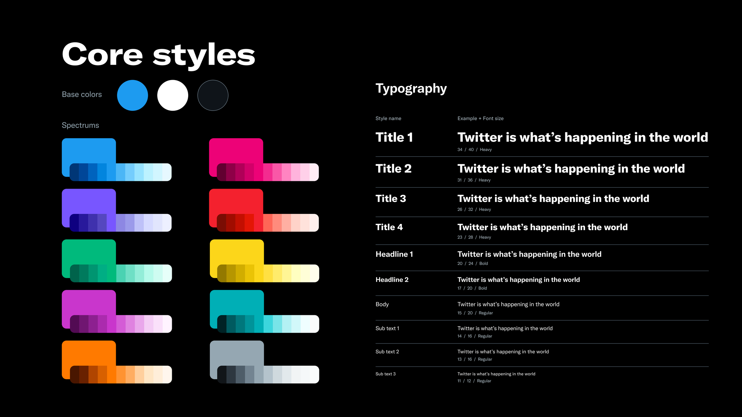
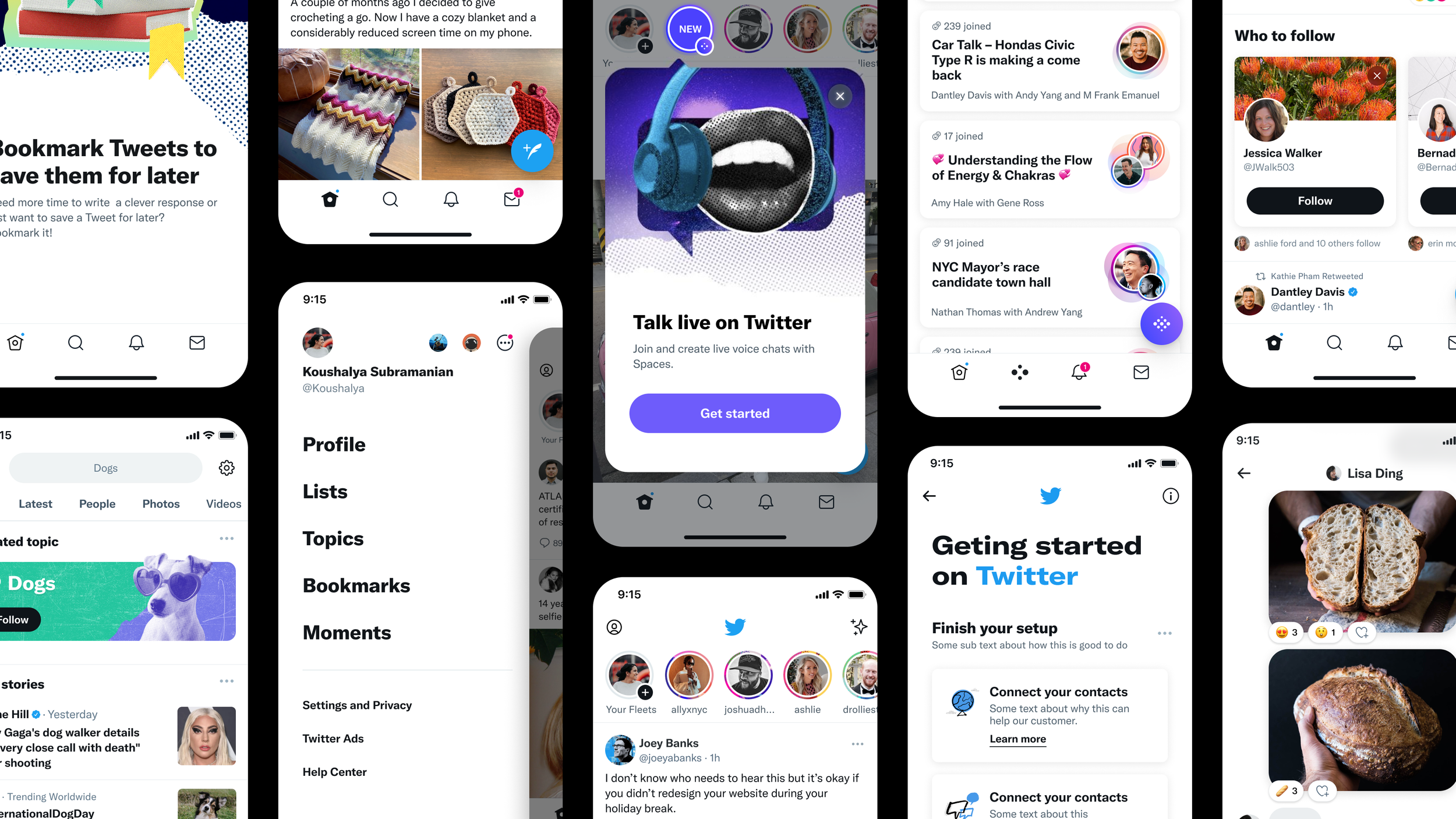
The Foundations team worked on evolving Twitter’s visual design language to align with Twitter’s new brand look: bold, raw, and unfiltered. A product’s UI isn’t always a 1:1 translation of a brand’s look and feel. There are different constraints and requirements. Our team met the challenge head-on.

THE PROBLEM

Twitter went through a brand refresh that evolved its identity. Those changes made the brand and marketing feel disconnected from the visual language of the product itself. It was time our consumer-facing products developed to align with the same energy of Twitter’s marketing voice. 


My ROLE

Product Designer

PROJECT LEADS

Ashlie Ford, Teresa Mershon & Audrey Davis

DESIGNERS

Jason Sofonia, Meghan M, Emma Lundin, Artem Artemov, Mustafa M, Anton Shultz, and Ed Wang

PROJECT MANAGERS

A’yen Tran & Christina Milan


THE BRAND

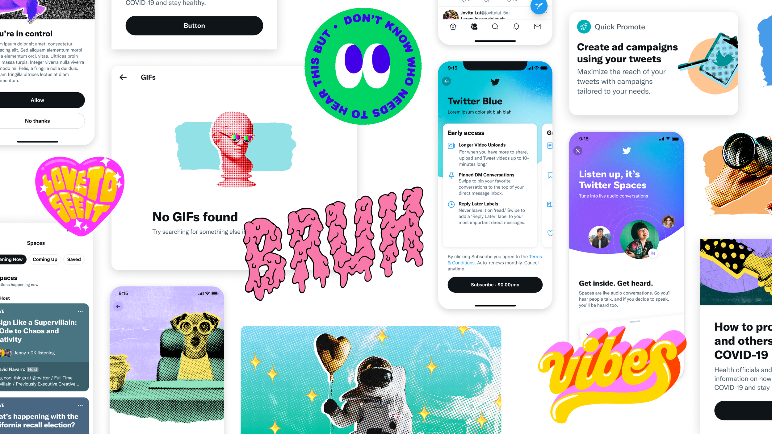
Twitter’s new brand style had an art-first approach that leaned on emotion and expression. The brand team built a system that could allow a range of topics and moods, like those discussed on Twitter.

Blog article with more brand process details.


OUR PROCESS

The Design systems team started by understanding and dissecting all the elements of Twitter’s new brand. The process allowed us to focus on all the overarching themes and form our design principles to guide the product's visual direction.

We also looked at all the styles we had explored via illustrations, stickers, and colors while the Twitter rebrand occurred.


EXPLORATIONS

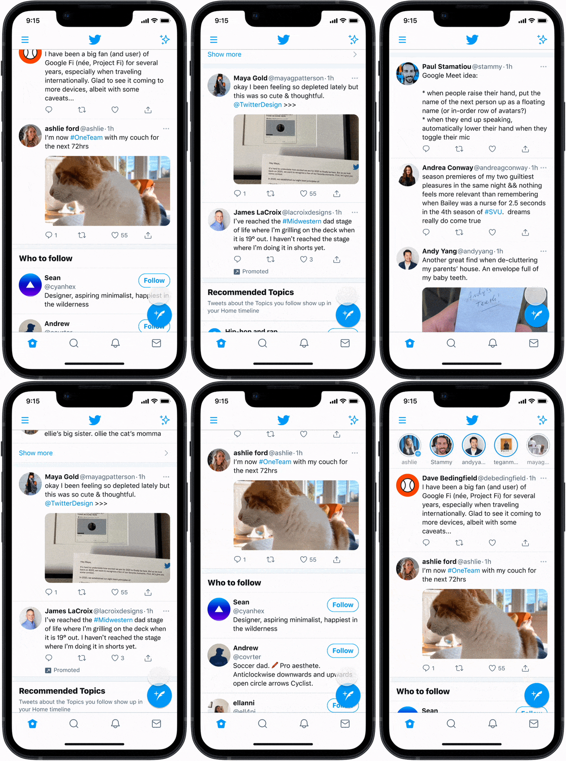
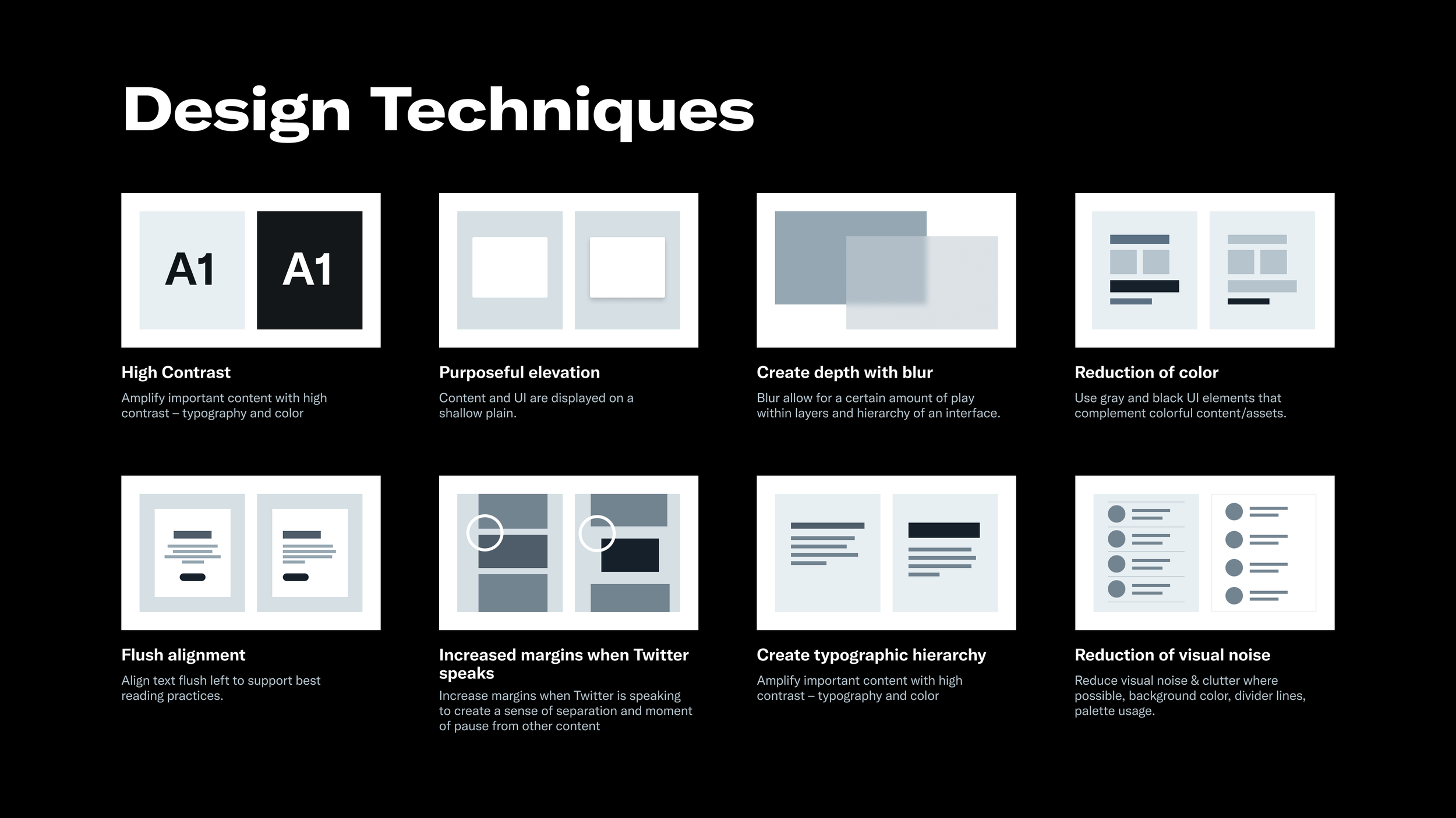
A large part of our work was defining the visual principles; these would guide our decisions as we explored the future visual language of Twitter.


before

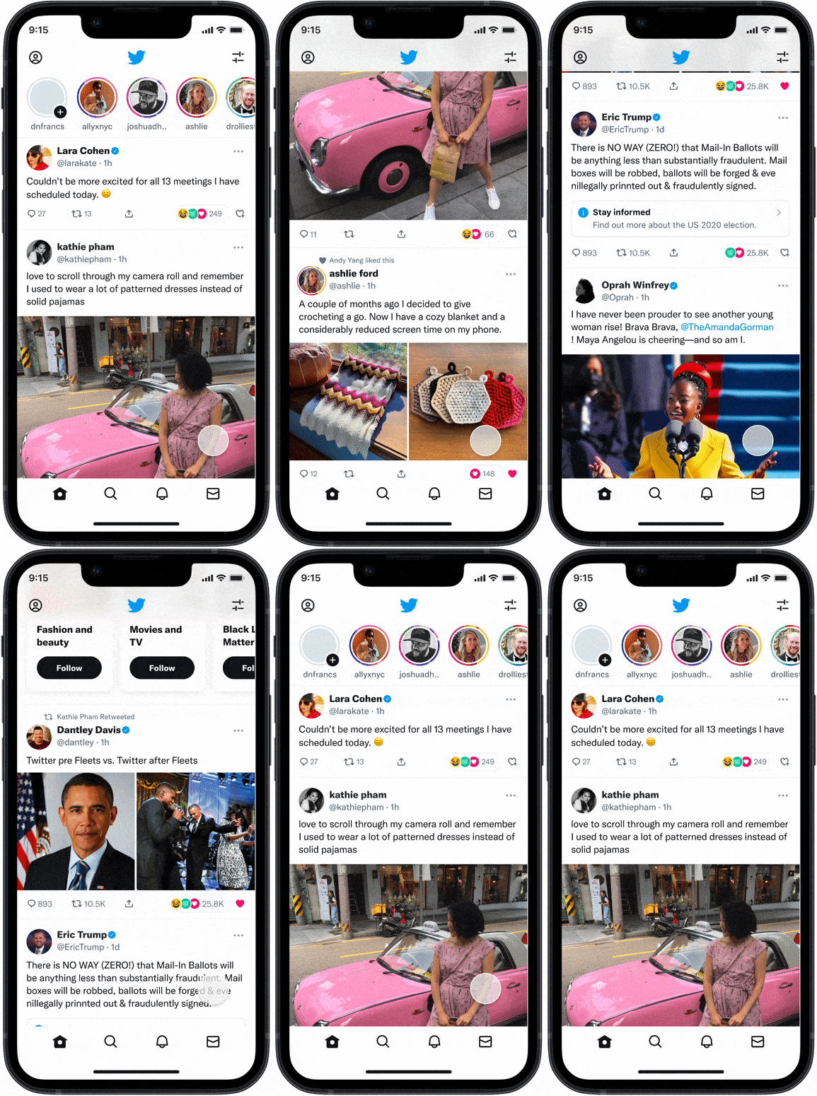
PROPOSAL


LAUNCHING THE NEW VDL

Our launch was slow and methodical. We ran experiments first to see if our type styles, color styles, buttons, icons, illustrations, and pattern changes would cause any adverse effects. Our final decisions were always based on data. There were times we had to roll back a few design decisions. Our priority was continuously improving the experience of our consumers.



UPDATING OUR DESIGN SYSTEM LIBRARIES

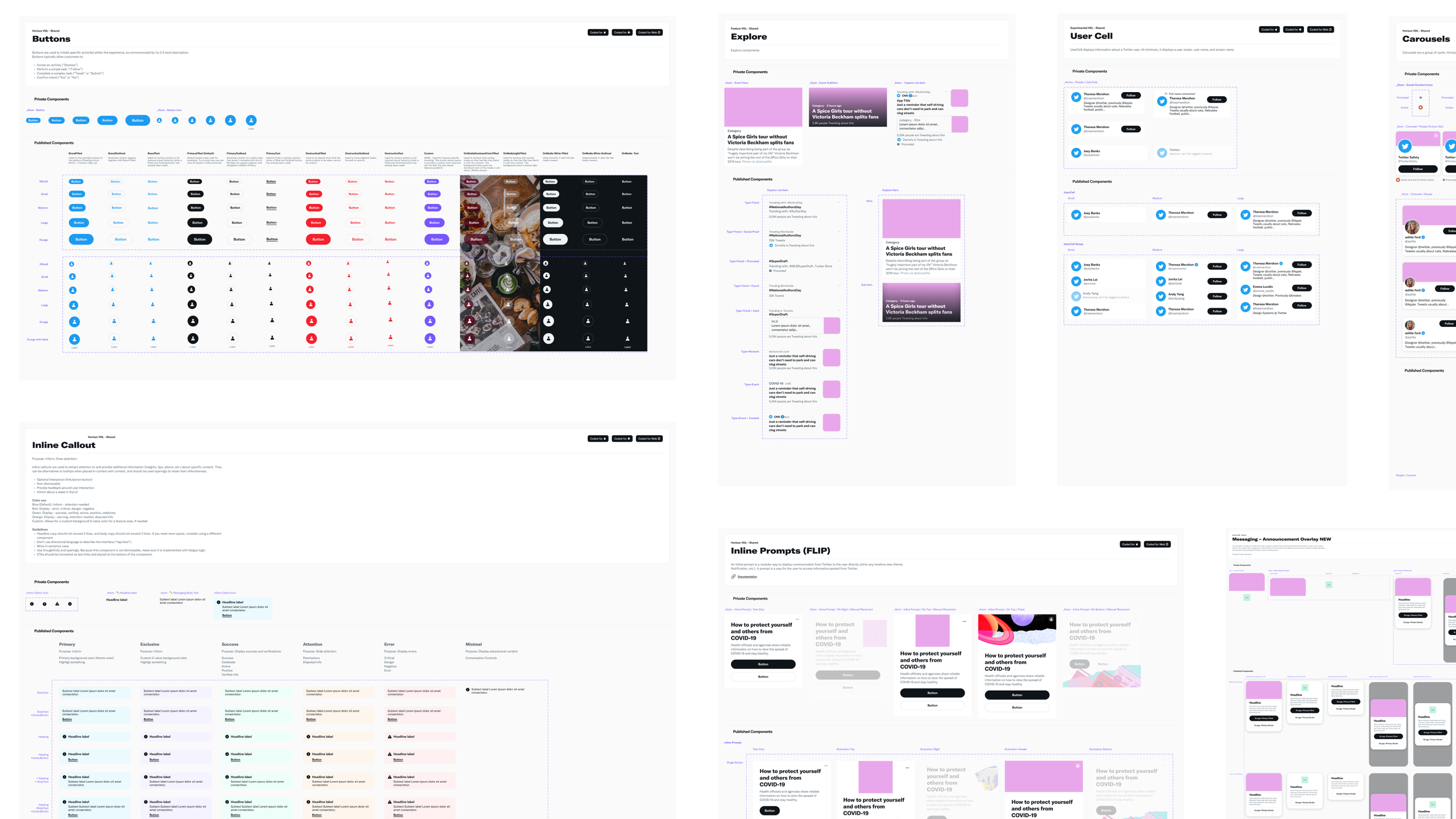
We took this opportunity to evolve our libraries and create and maintain a centralized documentation site for designers to access a single source of truth of all styles, design tokens, accessibility practices, patterns, and use case guidelines of the design system.


next
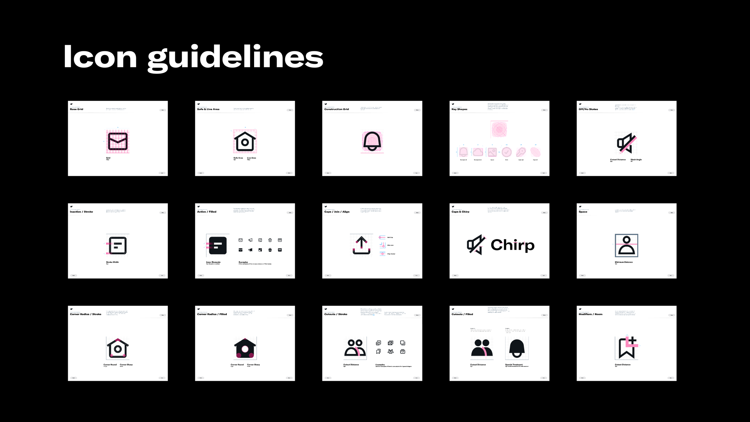
Refreshing Twitter’s icons